
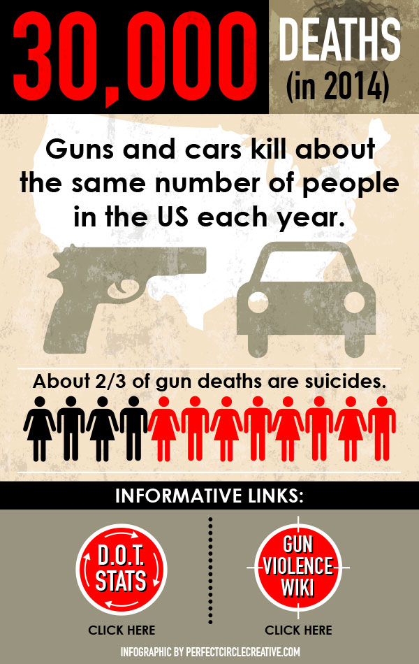
Below is an info graphic I designed as part of an ongoing series I’m developing for a client. Data visualization is a great way to get a point across clearly and quickly. Info graphics have evolved in recent years to be for mass communication, and thus are designed with fewer assumptions about the readers knowledge base than other types of visualizations.
Comments are closed.